For a blog about invisible disabilities, I sure took a long time to make my blog as accessible as it could be. I’ve now taken action to make that right, and I’ve created this article so other people can make their sites more accessible too. Accessibility is important, and if nothing else, it’ll help you keep more visitors to your site/blog.
A Basic SEO Option Also Helps With Your Sites Accessibility
Alt text (alternative text)
If you’re not already doing this, then get started ASAP. Not only will adding alt text to your images improve the accessibility to readers who have a visual impairment, it’ll also improve your SEO. If you don’t believe me, then listen to Moz.
Accessibility Options To Attract And Keep Dyslexic Visitors
Add extra space around headings and between paragraphs
This suggestion came from The British Dyslexia Association. If you ever wondered why I use a lot of spacing around my content, this is why. The reason I use a lot of empty spaces between paragraphs is to help break up the text to make it easier to read for people who are dyslexic, like me.
Justified text alignment
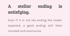
I’ve seen this on a few blogs, and found it weird and distracting when I’m trying to read their content. But I didn’t know what it was called until I came across UX Movement. Simply put, it’ll add spaces in weird place in the line of text to make it flush to both sides of the text box. For example, you’ll get stuff like: ‘hi, how are you?’ to fit the line fully or ‘h i, how are y ou?’. Justified text alignment also bugs none dyslexics too.

*Example taken from ninchronicles.com
Also, try not to use hyphens that split up a word at random when at the end of a line of text that finishes on the following line of text. I can’t spell a word at the best of time. If you portal the word to two different ends of a line of text, I’m going to struggle to read it. I’m also going to get frustrated with reading your content. Keep it simple by using a basic align left text.
Use white space to remove clutter around content
As I’ve already said, I do this by providing lots of white space between each paragraph, my images, and my adverts to declutter my website. I know this isn’t how most sites layout their content, and it doesn’t look as aesthetically pleasing, but I know it can help dyslexic readers, like myself.
Use short and simple sentences
I’m really trying to do this, but find it really hard, especially when talking about journal studies I’m using in my articles. But I’m better than I was when I started out blogging.
Avoid abbreviations where possible; always provide the expanded form when first used
The British Dyslexia Association suggests avoiding the use of abbreviations, which is understandable. If you don’t know the word they’re abbreviating or they’ve abbreviated a lot of words, you can easily get lost in what you’re reading. And there’s nothing worse than trying to search through the text looking for what the abbreviation stands for.
This is a problem I run into a lot when journal researching. It’s also something you run into when trying to avoid going over your word count for university course work. I over describe and struggle with condensing my work, so a way to save on your word count is to abbreviate.
I picked up this habit while doing my undergraduate degree before I even knew I was dyslexic. I always provide the full version of the thing I later abbreviate. With my blog, I try not to abbreviate words that aren’t already common knowledge, like OCD for obsessive-compulsive disorder. Although I may have let this slip a few times when talking about my borderline personality disorder (BPD), because of my overuse of the abbreviation in my everyday life.
Use sufficient contrast levels between background and text
This was another tip provided by The British Dyslexia Association. A simple black on white or white on black is all you need for this one. However, some dyslexic people may find white too dazzling and prefer a different background colour. Luckily, this is only really an issue when printing material to read; digitally, they will probably reduce the brightness to cope. So you won’t really need to worry about this.
However, you could choose a slightly greyed background colour, which I decided to try out. While researching this article, I decided to implement this accessibility option. So if you wondered why I’d greyed my background on the 10/11/2021, this is why, so I can improve my blogs accessibility.
Use simple font types
This can make the text easier to read and feel less crowded. Even when writing by hand, I avoid writing in joined up handwriting and lower case writing because I struggle with reading my handwriting. The last thing I want is to have that experience when reading something online. Really fancy fonts can be a genuine struggle to read.
Using fonts like sans serif fonts, such as Arial, and Comic Sans or Verdana, Tahoma, Century Gothic, Trebuchet, Calibri, and Open Sans (The British Dyslexia Association) will go along way to improving the accessibility of your content.
Break up the text with regular section headings in long documents and include a table of contents
Although this was recommended by The British Dyslexia Association, I have to admit, I’m not very good at breaking up my text with headings. I can rarely think of heading names with which to break up my text. I can also struggle to find a suitable place to insert a heading, especially ones that also help with my SEO. But I added a contents section to all my articles where there were headings used.
Ensure hyperlinks look different from headings and normal text
I choose to manually change all my hyper links in my articles and page texts to red because it fits with my logo, and it helps me massively with making them stand out from the text. A trick I used before I found out I was dyslexiac to help with studying was to write in bullet points and to write each bullet point in a different colour. Red and black were the colours that worked best for me. Greens and blues don’t stick out enough.
The three I struggle with
- Use active rather than passive voice.
- Be concise; avoid using long, dense paragraphs.
- Use short, simple sentences in a direct style.
These three were also suggested by The British Dyslexia Association. I’m dyslexic, and I learnt a pretty bad way to cope with the issues it caused me in my efforts to hide how stupid I thought I was. This was pre-spell check and autocorrect. Instead, we had to look up spelling in a physical dictionary meant having to at least have an idea of how a word was spelt in the first place. As such, I was left with habits that helped at the time but are now a problem with trying to make my content more accessible.
I’m trying my hardest to increase the accessibility of my work. I’m getting more concise thanks to grammar and spell check extensions, but I still struggle with this, and I likely always will. I over wrote to get around words I couldn’t spell, turning one word into a sentence as compensation for my issues with spelling. It’s a lot harder to stop doing than you’d think.
When reading long blocks of text, I often forget what I’ve read, as my dyslexia affects my short-term memory. The irony being that I can struggle to write concisely. So if you can, try making your paragraphs less dense and to break up large blocks of text into a series of smaller ones. Enormous blocks of text can be off-putting and a little daunting for people with dyslexia.
However, with active and passive voice, I have no idea how to make sure everything I write is in active voice, and I’ll switch without realising I’ve done it. Proofreading rarely helps me pick up on this issue either.
Use bullet points
A quick way to break up text is to use bullet points or numbering. I use this from time to time, but not as often as I should, due in part to my difficulties in making stuff more concise. Plus, WordPress doesn’t let me have a space between each bullet point, so that doesn’t break up the text well enough for me. If they changed that, I’d use them more.
Visit The British Dyslexia Association for more tips on how you can make your content more accessible to people with dyslexia.
Colour Blind Visitors
Avoid green and red/pink
Surprisingly, this too was suggested by The British Dyslexia Association. So, I’d like to apologise to anyone whose colour blind for my use of red hyperlinks, but it helps me to identify my own hyperlinks and it’s in keeping with my logo’s colour theme. I hope you can forgive me for this one. I’m hoping it’s not much of an issue as it’s red and black, unlike using greens and blues.

WordPress Plugins
One Click Accessibility
I tried this plugin out for myself, and you don’t need to do anything to set it up as you’re ready to go as soon as you active the plugin. Going to Appearance > Customise will allow you to change the appearance of their floating icon that’ll open the accessibility options. Some of the accessibility options this plugin offers include changing the font type, the font size, background colour, underlining links, and changing to grey scale.
This is the current plugin I have installed on my site. If you see the blue disability icon hovering on the left-side of the screen, that’s this plugin. I also have it installed on my blogs shop, but it’s on the right side instead over there.
Just click the blue disability icon to open the menu and experiment with the settings to make my blog more accessible to you. Or, you could just try it out to see if this is something you’d like to and to your website.
WP Accessibility
I installed this app and went to its setting to set it up and it offers a lot of settings options. I’m sure it’s a great plugin for accessibility, but I was a little overwhelmed by it. As such, I didn’t fiddle with the settings, as the One Click Accessibility just seems like an easy decision to use instead.
WordPress has several other accessibility plugins available, which you can view by clicking here. The plugins range from more comprehensive accessibility options to the more stand ones, like a widget for changing font size.
Summary
Look, we’re not all going to be able to follow every single piece of accessibility advice, and that’s ok. Even I won’t be able to do all of them, and I’m an invisible disability blogger. I just suggest doing what you can to help make your site more accessible where and when you can.
As always, leave your feedback in the comments section below. Also, please share your experiences website and blog accessibility in the comments section below as well. Don’t forget to bookmark my site and if you want to stay up-to-date with my blog, then sign up for my newsletter below. Alternatively, get push notifications for new articles by clicking the red bell icon in the bottom right corner.
Lastly, if you’d like to support my blog, you can make a donation of any size below. Until next time, Unwanted Life readers.


I tend to use bullet points but had not heard of a few of these strategies. Thank you.
I hope the new accessibility options prove useful
That was a very interesting post. I knew some guidelines, but never the reason behind it. For example font styles. I like them curvy and fancy, but fight the urge to use them because “it’s nit recommended and some might not like these”. Your explanations makes much more sense!
Justified I let go long time ago, but because I think it looks ugly, when I don’t have enough words to fill lines. Nice to know it also serves bigger cause and helps.
Justified alignment is weird, I’m not even sure why it’s a thing. It just makes most text look really strange
I’ve actually been thinking of accessibility on websites recently. I have uveitis and often the black on white can be quite harsh and cause pain. But actually the slightly greyed background you have is much softer.
I learnt the importance of alt text before starting my second blog but am now going back to correct all the images on my first blog.
It’s obviously difficult for bloggers to realise these things when they don’t suffer from the likes of dyslexia or colour blindness, so this article is really helpful.
I’m glad my greyed background has paid off with it being easier on your eyes
A little while ago I went back and added alt text to my blog images, and I didn’t know about using shorter sentences. I am the worst for over-complicating my sentences, so I love this reminder to be a bit more accessible 🙂
We can all make the online world a better place by being aware of how to make that space more accessible
These are fantastic tips to make our blogs accessible to everyone. I especially love the one-click accessibility plugin. I just installed it on my blog!
The one click plugin is super handy isn’t it
This was really useful and I really appreciate the info you’ve put together — thank you! I will be putting these tips into action.
I look forward to seeing when you’ve put some of these in place
This was so informative! I have been thinking for a while on how to make our website more accessible and there’s surely a lot of things to help and make it easier for people to read. I didn’t know that a greyed background could help, so will check what to do and be more coincise when writing too. I tend to go over very long sentences! Thanks for sharing!
I hope the information helps your blog to become more accessible
All great tips for technical writing and information design as well as blogging. I think the BBC has some excellent examples of great accessibility options too.
I didn’t know the BBC had information like that. I’d love to check that out
https://www.bbc.co.uk/accessibility/forproducts/guides/mobile/principles
That’s a good overview. There’s a whole site somewhere with options but I can’t find it again. I have it in a bookmark at work so can dig it out next week.
Awesome. Thank you
Oo, I am loving the one click accessibility option! That is so handy to have and it sounds easy to set up.
Using clear hyperlinks and a good font is also important to me, but I confess I struggle with active voice in my longer posts. My SEO checker tends to remind me to switch in active counterparts, so it is good practice as I try to write more actively straight off the bat.
Finally, as the owner of Nin Chronicles, I feel compelled to immediately fix my justification issues. ?
Thanks so much for sharing!
The accessibility plugin is really is super easy to set up, anyone could do it in minutes
Great post! I never thought about making my blog more accessible, but I do care about it being easy to read and navigate. I’ll keep your tips in mind 🙂
Thanks for commenting
You’re not the only one who didn’t know about or sort out better accessibility at the start of their blog’s life. It’s all a learning curve and it’s posts like this that make the difference so we can keep it in mind, think about it, learn where we could improve and how to do it.
I do alt text, more spacing around headers, try to keep sentences and paragraphs a bit shorter these days, and add the full version of something at the first use of an abbreviation, but I think I’ve always done that in letters and such.
I try to do most of these you’ve included here, but I’m still not happy with how my blog looks in terms of general layout, colours, font type & size. It’s a work in progress. I’ll have to have another look at it, see if I can figure out what’s bugging me about it and how to make it clearer. Your dyslexia gives you such an edge on this and offers insights I wouldn’t have known about (like how I’d never thought of justified text alignment), so thank you.
Fab post ?
Caz xx
Thanks for sharing your insight. Often these things are something we should always revisit to make sure we’re being as inclusive as we can be, as things change and new ideas to do better will be suggested and made available
You’ve given us some amazing tips which I’ll for sure be doing to my blog to make it more accessible. Thank you so much for sharing this with us, it was super interesting and helpful Xo
Elle – ellegracedeveson.com
I look forward to seeing the changes you make
Some great advice here, including things I hadn’t even considered before.
Thanks!
Thanks for commenting
Thanks for all these tips. One thing I learned through a library webinar was that screen readers for seeing impaired read everything, so always hyper link to words rather than leaving the whole http address for the screen reader to slog through one character at a time.
Oh wow, I didn’t know that. Thanks for sharing that great but of information. Maybe I should revise how I do my references to account for this
Such important info! Thank you for sharing. I will have to go through my site and see what I should update. ??
I look forward to seeing what changes you make
such an informative post! I need to update a few old posts and include more plugins.
Thanks
Thanks for the great tips! We just started our blog.
Good luck with your blog
These are some execellent tips. I recently learned about the importance of adding Alt text on my blog pictures. It makes a whole lot of difference with SEO. Like your idea of spacing around block text. I use elementor. It’s a pefect tool for blogging. Thanks for sharing ?.
Great post. Have a great new year!
Thanks, you too
There are so many really good suggestions to help make your blog for accessible. I am quite impressed I do a lot of these and I know from a blogger who is blind that she really appreciated the alt text. So it was nice to hear it was beneficial. Thank you for sharing these other important tips.
Lauren – http://www.bournemouthgirl.com
Thank you ?
This is a helpful and great post! Thank you for sharing.
Thanks
You’re welcome
“Use active rather than passive voice” made me smile as that is one of my stumbling blocks too! I have a dyslexic friend and we have family members who are colour blind so some of the things you mention are familiar to me. But I learned lots of new things too! Thank you for such an informative post.
I just can’t seem to wrap my head around active and passive voice
Brilliant post, thank you for sharing, I’ll definitely be looking at how I can implement these on my blog to help make it more accessible.
I hope they make your blog more accessible
This is a fantastic little of tips one of the best i have read thanks for sharing ill be using a few of these
I hope you find some of tips useful for your own blog
Fantastic idea to download the plug-in that makes your site more accessible! I’m going to immediately download it too that way I can help make the online world easier on my blog.
You’ll have to let me know how you find the plugin
I always make a conscious effort to write using an active voice but it’s so easy to go into the passive. I always make a point to proofread and make adjust passive sentence structures.
Thanks for commenting
Excellent points here. Following this advice will make our blog accessible for most if not all readers who would come across our blogs. It’s all about putting yourself in other people’s shoes to improve the user experience.
Ryan
Indeed it is
Great article as always! Wow that ‘One Click Accessibility’ sounds really great. I’ll definitely look into that 🙂 I’ve heard about Alt text (alternative text) before, and to be honest I really should get on it as I have heaps of images. Thanks for sharing such great advice.
That plugin is super easy to use and will allow you to increase your blogs accessibility with almost no effort
Thanks for these tips, they are very useful for anyone who has a blog and work online:)
xx Dasynka
Thanks
thanks for the advice. I think I follow many of them on my own site as it is a must to help score high on seo. plus many of the tips are things that many of us should have learned in high school. I have been looking for a good accessibility plugin and will try out one-click accessibility on my blog to see how it works. thanks <3
I just saw that you’ve used the plugin on your blog ?
Yes! Thank you again. I love it <3
I’m glad you like it
This is such a helpful post & I didn’t know about some of these like how it’s helpful to have extra spaces between paragraphs.
What color for hyperlinks would be the best with a black font since you mentioned greens, blues & reds/pinks are not the best?
Also I’ll have to look into the one click accessibility plugin
I think as long as your have a neutral background and only use two distinct colours for text (text and hyperlinks), you should be fine. So don’t use greens with reda or different shades of red with red as they won’t stand out, that kind of thing. Black and another distinct colour should be fine
Oh okay thanks!!!
I really struggle with understanding active and passive voice, it’s something I’ve been reading about over the last few days but can’t get my head around it. I didn’t know about the accessibility plugin, thanks for sharing about it, I will have a look.
I do add alt text, but there are many I still need to update. It’s a work in progress but I’m getting there slowly. May I share this in my newsletter?
I see you’ve decided to use the plugin, which is awesome. Please do use it in your newsletter. The more people who make their websites more accessible the better
This advice is great and very helpful for blogger and online worker
These are great tips for accessible, its not just people with dyslexia, its other people that have other neurodiversity issues, like myself, I find some blogs a struggle to read with massive text, left aligned text and unnecessary spaces between paragraphs, as I find them very hard to read with my poor eyesight
So you have to cover everybody on our blogs not just one group of people
Thank you. My biggest pet peeve are blogs that are all dense text and none existent paragraphs